43
votes

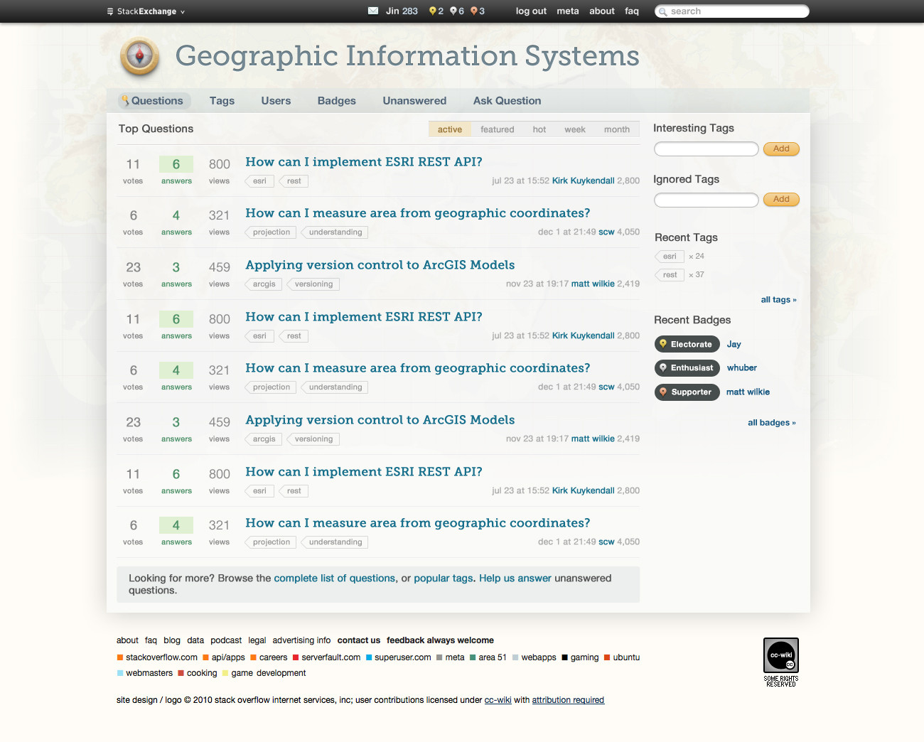
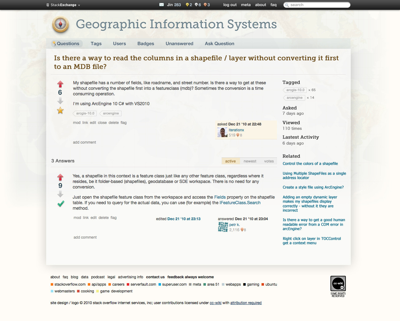
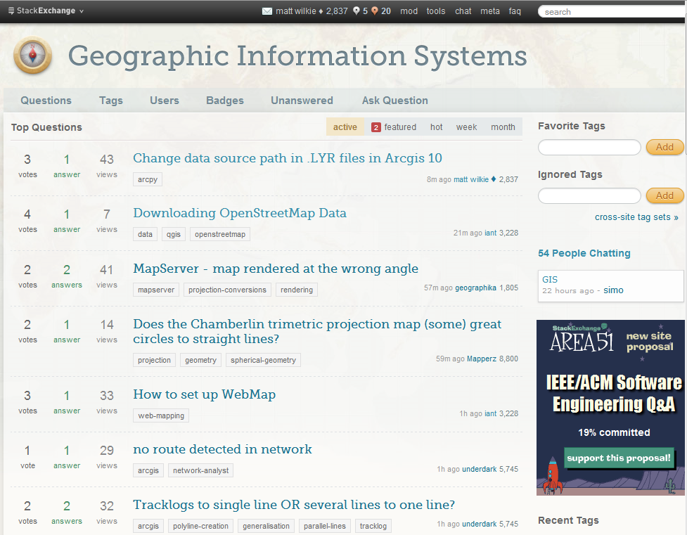
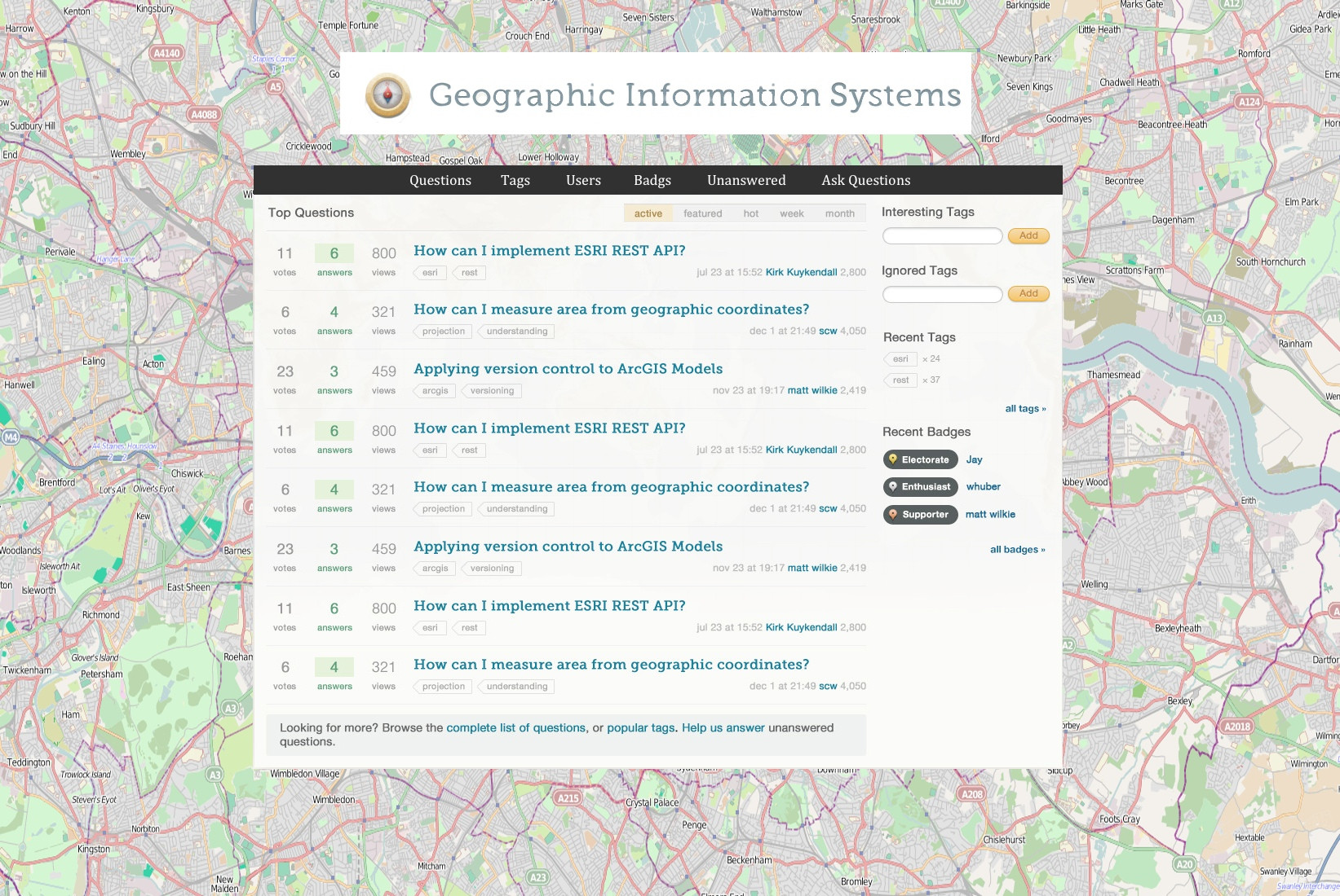
Hi all. I'm Jin, and I'll be working on the final designs for the Stack Exchange sites. Each site will have its own unique theme that will reflect its topic. However, all sites will share quite a bit of common elements so they feel like they're part of the Stack Exchange family. As part of the 7 Essential Meta Questions of Every Beta, we're supposed to be working on the site design and logo. Below are some of my early design ideas for the GIS site.

This is a period of sharing of ideas and information between artists and technologists.

That quote is from one of the many articles I found while researching for the GIS site design. I've been reading related materials on the web, as well as the type of questions asked on GIS.SE. I find the field of GIS very fascinating, since it combines long established cartography and modern day technology. I believe an appropriate theme should reflect some hints of vintage cartography AND the modern tech elements. Additional design goals are to make the site easy to read and welcoming to new users.

To convey the vintage theme, I created a compass icon for the logo and used a faint world map as the back drop of the site. I felt the compass is appropriate since it has timeless visual association with maps.

The type of questions asked on the site are mostly technology related. Modern day GIS are used in apps, so for the content area UI, I think a sleek "web app" look works well. It provides a nice balance to the retro logo and site background.

The overall color scheme is earth toned pastel colors. I think the combination gives a warm and soothing feel.

Without further adieu, here are the design mockups. Although they may not have all the site elements, they should give you an idea of the overall look and feel.

(click to see the full resolution versions)

alt text

alt text

Please let me know what you think.

12
  • 15
    big thumbs up from me! Commented Jan 5, 2011 at 23:49
  • 3
    I agree...easier on older eyes, which is important for those of us in that realm
    – user681
    Commented Jan 6, 2011 at 0:22
  • Another thumbs up from an old guy with reading glasses.
    – Tim Rourke
    Commented Jan 6, 2011 at 15:16
  • 5
    I really like the mockups, especially the world background. I also think the compass as the sites main symbol and the placemark balloons for the badges are really cool. Great job!
    – Andy W
    Commented Jan 6, 2011 at 17:35
  • Looks fantastic - I especially like the typography choices you made. Commented Jan 6, 2011 at 20:56
  • 4
    Very good. I'm impressed. Still clean and uncluttered while have a distinct GIS-y feel. As good or better than any StackExchange site.
    – Sean
    Commented Jan 6, 2011 at 21:32
  • absolutely love it!
    – Petr Krebs
    Commented Jan 7, 2011 at 16:09
  • Absolutely love it. Nicely done.
    – malonso
    Commented Jan 11, 2011 at 2:20
  • I think it is great and I wouldn't change a thing. \
    – TheSteve0
    Commented Jan 13, 2011 at 7:19
  • Perfect as is. Well done Commented Jan 18, 2011 at 19:17
  • I really like this design.
    – Nathan W
    Commented Feb 7, 2011 at 1:47
  • This question appears to be off-topic because it is about design decisions being discussed 2.5 years ago and made not long after that.
    – PolyGeo Mod
    Commented Aug 29, 2013 at 4:37

11 Answers 11

14
votes

How about a symbol that looks like a traditional cartographic north arrow for the up and down vote? Pictured below is just an illustration of what I am suggesting, I'm sure someone can whip up a nicer looking example or different types of north arrows. The compass rose for a favorite icon (to the right of the north arrow) appears to be less contentious to the community at the moment.

I've made the question community wiki so anyone can update with any images.

Ugly looking North Arrow

alt text

Compass Rose for Favorite Symbol (picture suggested by Jin)

alt text

10
  • That's a great idea Andy. The icon styles in my mockup are a bit 3d web app buttons. But I'm open to a flat look too. I can totally see the fav star being the same treatment as the arrow you suggested. for example: i.imgur.com/9GYfC.png
    – Jin
    Commented Jan 6, 2011 at 17:43
  • 8
    Yes to to a compass/north arrow for the vote icon. No to that particular example image, I've seen it (ab)used way too many times in amaturish compositions! Yes to a compass rose as the the favourites icon.
    – matt wilkie Mod
    Commented Jan 6, 2011 at 18:31
  • @matt do you have any good examples of compass arrows? keep in mind, we have to make sure the arrows+fav stars are still evident enough to be action icons, instead of decorations. So they can't look too too fancy.
    – Jin
    Commented Jan 6, 2011 at 18:46
  • 1
    I think this would get a bit too cute.
    – Sean
    Commented Jan 6, 2011 at 21:33
  • @Sean , I agree that too much flair such as this could be tacky. But I do feel for the site to be individualized from the other SE forums it is appropriate to add in unique to GIS elements such as this.
    – Andy W
    Commented Jan 7, 2011 at 16:52
  • The map police might take issue with North being good (an upvote) and South being bad (a downvote). Any Aussies out there got an opinion? Commented Jan 7, 2011 at 17:18
  • @KirkKuykendall , I was only implying the arrow for the symbol, I didn't mean to suggest the actual North label.
    – Andy W
    Commented Jan 7, 2011 at 17:23
  • 3
    @jin, perhaps just a standard compass needle, with points in both direction simultaneously, with one side emphasised.(vista-style-icons.com/libs/biz-v/compass_needle-icon.gif) I would do it monochrome as colour has tendency to associate with good/bad values. One could also vary the arrow style on the up/down side (jan.eaglecreekobservatory.org/compass.jpg)
    – matt wilkie Mod
    Commented Jan 9, 2011 at 6:07
  • I removed the images for my suggested arrow as that is now in a seperate post.
    – matt wilkie Mod
    Commented Jan 13, 2011 at 18:20
  • I don't think using a compass needle adds anything to the site and I vote to just use the first up and down arrows suggested by Jin.
    – PolyGeo Mod
    Commented Jan 17, 2011 at 3:19
9
votes

Hi Jin,

Thanks for the wonderful job you've done on these first mockups! Its great that Stackexchange is willing to invest expert time in making these sites visually representative of their specific audiences.

The fonts, use of pushpins, and the compass are all great: they work well and add a nice flavor to the site.

A few minor ideas: I like the look of the #tab bar on sites such as Ask Ubuntu, I can see the argument to keep them as a visually identifiable block, but think either a smoother style or removal of the background and top/bottom borders.

Playing around with the iconography used for the up/down arrows is interesting as Andy mentioned: you could keep it in 3D by taking a 3d rendered compass rose, and reusing only the north and south pieces of it. Similarly, you could use the north/south of a compass pointer to create a similar effect.

Even a more minor detail might be modifying the star, one idea I like is using it to throw in a shout-out to projection, which plays an important role in geographic problems. The American Association of Geographers logo provides an example of this.

Finally, another 'nice touch' that may or may not be worth the effort is using one of the color brewer schemes for some of the visual elements: they provide a connection back to maps, but also a nice way of visually distinguishing elements that are 'positive' and 'negative' within the site.

I can provide more context if needed, and help generating some star projections if you do think the idea's worth taking up.

5
  • I think a legend is apropos for this site as well, as well as the nod to projections.
    – Andy W
    Commented Jan 7, 2011 at 16:53
  • I like the suggestion about fitting a projection in somewhere. Commented Jan 7, 2011 at 17:21
  • 1
    thx for the input. for tab bar, are you talking about main nav(questions, users etc) or the sub tab? (active, featured etc)? I like the compass pointer arrow idea, it'd go well with a compass rose fav star. For the fav star I think it may look better as compass rose since it's close to the arrows. Also the size of the star is rather small, not sure if the project lines would show up well. (the inactive state is even fainter). where else would u suggest to use the projection idea? thanks for the color scheme link, i'll tweak accordingly.
    – Jin
    Commented Jan 7, 2011 at 21:23
  • 1
    @Jin by tab bar, I meant the subtab (#tabs) section. I could imagine something projected for the icons, but I agree it would be difficult to keep clarity -- if you just kept it as the graticule lines, it could work, but not with a map image as well. Perhaps easiest way to work in projection is to reproject the current image used in the background: its currently in Mercator, which is common in maps but generally disliked by geographically inclined (it heavily distorts area).
    – scw Mod
    Commented Jan 8, 2011 at 9:02
  • One thing not to pick up from Ask Ubuntu is placement of the search box. I find it too much out of the way there (I'd rather it be in proximity to the "Ask a question" link). ...Looks again: actually the search box placement is the same as everywhere else, it's the strong red-orange nav bar which obscures it.
    – matt wilkie Mod
    Commented Jan 9, 2011 at 5:58
9
votes

Example of vote up/down arrows using compass needle motif. Posted seperately so it can be voted up/down on it's own merits.

alt text

4
  • I removed the N/S letters so as note to associate N-good and S-bad. However now it doesn't look so much like a compass needle anymore. Maybe if "N" flipped to point downward with a downvote?
    – matt wilkie Mod
    Commented Jan 11, 2011 at 21:56
  • My only concern with this one is that it's pointing both directions. the convention has been one way arrow. also keep in mind the width of the favorite star needs to be about the same as the arrows, this would cause the arrow you suggest too tall. I think I prefer the first arrow in Andy W's answer, without the N. What do you think?
    – Jin
    Commented Jan 11, 2011 at 21:59
  • the similarity is obvious to me: imgur.com/kiWFB. The needle is pretty tall though, compared to the other design elements. I still like it, but you're the one who needs to make everything fit together and look like they belong that way. So you should follow your own muse to that end.
    – matt wilkie Mod
    Commented Jan 11, 2011 at 22:12
  • 1
    I think I misunderstood that arrow before, now I see the # of votes is in the middle. I was under the impression you wanted 2 of those arrows. I like this concept. However due to layout restriction I don't know how this will work out when the vote count goes up to 3 digits. I'll create a mockup based on your concept though.
    – Jin
    Commented Jan 11, 2011 at 22:22
8
votes

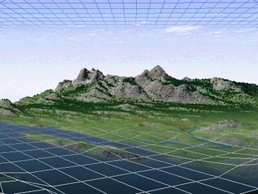
For communicating the idea of vintage<-->modern fusion, I'm often drawn to images which combine a gridwork of lines. So in this context something like the underneath, but using a vintage map instead of faux mountains.

gridlines merging into faux mountain scene

3
  • +1 Great idea, better than compass IMO.
    – Adam Matan
    Commented Jan 7, 2011 at 11:28
  • I like this idea as well: something which shows the representation of the earth as containing data. Another idea in this realm is something like the fused nighttime at lights / MODIS world image used on Blogspot: geohack.net/gis/image.jpg
    – scw Mod
    Commented Jan 8, 2011 at 23:53
  • 1
    Actually I want to amend my initial statement somewhat: use a vintage map AND natural landscape scene AND a grid work (and perhaps some raw numbers). Combining the concepts cartography with it's long history, the real world, and numbers & data into cohesive system is what GIS is all about.
    – matt wilkie Mod
    Commented Jan 11, 2011 at 22:00
6
votes

Empahtic agreement with the design principle "an appropriate theme should reflect some hints of vintage cartography AND the modern tech elements.".

I like the muted map background, though it might be lean a little too far to the subtle side (I know it's a hard balance to reach). There are many excellent candidates of vintage map backgrounds to choose from on http://www.davidrumsey.com/ (also see What Makes a Map Beautiful?).

A serif font is appropriate.

The compass motif is good. The current graphic looks a little odd to my eye, perhaps the north should be off centre a bit (I'd point to the upper left). It's also a little too... 3dish, bumpy? maybe back off the drop shadow a bit. I'd also mute/deepen the red of the needle. I find my eye getting drawn to it too readily; very appropriate with the real thing in the field but distracting here.

2
  • 1
    I agree with the comment about the map - it's too faint for me to pick out, and I'm not sure I would have been able to identify it as a map if others hadn't pointed that out. Caveat: I have lousy vision. Commented Jan 7, 2011 at 4:40
  • I agree with the compass looking too bumpy, at a distance it's almost like a reptilian eye :) That's my only little disagreement with the layout otherwise very nice, good work and thanks. Commented Jan 31, 2011 at 12:44
6
votes

How about this main menu bar? and i think it will be good if we extend the map image alittle bit bigger and write inside the heading "geographic information system".

image: menu link

5
votes

Really like it! One of the things I like most is that its clean and clear, I know what people are getting at with the compass arrows but adding clever stuff like that also takes away from the clean original design.

2
votes

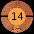
Another idea for voting button: a style that looks something like an old theodolite disc.

enter image description here

2
votes

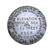
An idea for favorite button: a geodetic mark. (need to change the inscriptions).

enter image description here

2
  • I'm not sure users will associate this with "favorite".
    – underdark
    Commented Jan 27, 2011 at 23:31
  • Yes you are right, because the "international symbol" for "favorite" is a star.
    – Pablo
    Commented Jan 28, 2011 at 11:20
2
votes

I love the design Jin. Thanks for your hard work and fine eye putting it together.

Can anything be done to integrate the area51 advert area on the side? As it is now it sticks out like blaring a trumpet. It's the most predominant element on the page by far and just doesn't fit. I definately agree we should have a prominent link to area51, our cradle, but I don't think it should be more "important", visually, than the site itself.

enter image description here

1
  • this is a standard for all launched Stack Exchange sites, to help promote other useful proposals. We're enhancing this ad to also include community ads that you can create here on meta and vote up to have them appear there. More details on this on the blog soon! Commented Mar 8, 2011 at 21:19
1
vote

with permission of Jin i am changed the template to this design.

Like load the background with some live google map or openstreetmap in the template. like the the cream main div float over the layer of a live openstreetmap or google map.

This is just an idea. Workout on it..

Have a nice day Friends...:)

enter image description here

7
  • Wouldn't want to load such a big background picture with a slow internet connection.
    – underdark
    Commented Jan 31, 2011 at 23:11
  • 3
    @Jaison I think the design should have elegance and subtlety, instead of being overwhelmingly "mappy."
    – Jin
    Commented Feb 1, 2011 at 5:55
  • maybe you could fade white the background a little.
    – Pablo
    Commented Feb 2, 2011 at 16:09
  • @underdark: not putting a big background image, instead of that put a div of google map or bing map or openstreetmap etc. so the site become more lively. Commented Feb 5, 2011 at 3:57
  • @Jaison: The resulting page loading time will be long anyway.
    – underdark
    Commented Feb 5, 2011 at 9:11
  • @underdark: No.. the map will load much faster that an image. i think. let me try it. Commented Feb 5, 2011 at 17:32
  • your website is beautiful for gis collaboration wiki.
    – user3120
    Commented Jun 6, 2011 at 22:52

You must log in to answer this question.

Not the answer you're looking for? Browse other questions tagged .