8

UPDATE - We've pushed this live for everyone now. Thanks to those who took the time to give feedback. Please do know, being live doesn't mean we can't address further changes for you! Write an answer if you find anything that needs addressing.


As part of implementing the new unified themes across the network, we're gradually rolling out updated site themes for each site. As of today, we have enabled your updated site theme for testing.

If you can't see it right now, that's by design! This is a very early test implementation of your design and we need your help finding issues with it before we make it live for everyone permanently. So, keep in mind, there will be things that need fixing! We'll address those things as we can.

If you'd like to review it, here's how:

How do I enable it?

Click here and check the "Beta test new themes" option. This will turn on the new theme for all sites that have one in testing, including this one. Here's more info on how to opt in. You can uncheck the box to revert to the older theme until the site is live for everyone. Note, while turning it on is immediate, it will take a few minutes to revert to the old view - but it will go through!.

What type of feedback do we need?

On this post: Bugs related to this site's design elements

Please help us look for issues/bugs related to the theme design and how we have mapped the old theme to the new. This needs to be done within the limits of the new unified theme.

This could include colors of sections of the design or text, problems with JavaScript add-ons (if applicable), the logo or top banner appearance or other artwork.

You can also feel free to ask questions about the new layout if you're unsure how to navigate it.

On Meta Stack Exchange: General concerns about left nav or theming

There are some things that are definitely changing everywhere and can't really be adjusted on a per-site basis. A few of them include:

  • Top banner is shorter in height, so some artwork has to be adjusted along with some logos.
  • Left Navigation is active everywhere (but can be collapsed into a menu by visiting your site preferences - instructions here).
  • Responsive layout is active, which lets the site adjust as browser widths change - no side scrolling (some pages haven't been updated, yet, though). For now, if you prefer the scrolling, you can disable this by clicking the "disable responsiveness" link in the footer.
  • Many site elements including tags and voting arrows are standardized across the network.
  • For Serif sites only - This site uses a Serif font but common elements across the network (headers, sidebars, buttons, tags, queues, etc) are now sans everywhere.
  • Link underlining is active. In an effort to make links more visible, they are now being underlined.

If you have concerns or issues regarding the left nav or the overall approach we are taking to theming, then this Meta Stack Exchange post is the right place for feedback.

As I mentioned earlier, there are some unique design elements like voting arrows and tags that are being standardized in this process. Keeping these custom elements makes our ability to maintain the sites too complex and, while we're very sad to see them go, we're in a difficult position of needing to make the site designs work together so that we can continue to address feature requests and bugs that will make your Q&A experience better. This is addressed in a Meta Stack Exchange post if you want more detail.

What new themes?

If you're like, "What the heck are you talking about?", then you should read the Meta Stack Exchange post entitled Rollout of new network site themes (and maybe the posts it links to for the full background). To follow along with the rollout of these new themes, go here.

Thanks so much for your constructive feedback!

Oh, Who am I?

If you don't know me, I'm one of the Community Managers here at Stack Exchange. I'm here to listen to your input and convey it to our Design team for responses and fixes to bugs. I'll do my best to respond to your concerns and explain whether changes we've made are bugs that can be changed or if they're by design and why.

0

5 Answers 5

2


The 'next badge' bar in user's activity page has an invisible fill colour (specially gold badges).

Current:

enter image description here

I suggest darkening it a little bit:

enter image description here

2
  • 2
    This mostly a problem with the gold badge progress bar. Silver and bronze progress bars are somewhat visible, but it would be better if they were darker.
    – csk
    Commented Sep 27, 2018 at 20:51
  • 1
    This is unrelated to the design changes. We can look at it in the future when we do start making the profile pages responsive but this is network-wide, not specific to this site. It's the same on every site on the network. For example: movies.stackexchange.com/users/1190/ankit-sharma
    – Catija Staff
    Commented Oct 8, 2018 at 19:02
2

The contrast of question titles to the background is too little. The headers look like inactive/visited links to me. Please use a bold color.

enter image description here

https://webaim.org/resources/contrastchecker/?fcolor=358DAA&bcolor=F9F8F6

2
  • 1
    Right now there is no difference between visited and unvisited for me. The one on CVSE is too little on contrast between those two states themselves as well. Commented Oct 11, 2018 at 9:51
  • This has been addressed (it was made a few months back, we forgot to update here at the time).
    – Yaakov Ellis Staff
    Commented Sep 5, 2019 at 11:42
0


Strangely, questions which carry numbers on title have them vertically misaligned from the other parts. See for example, numbers 3, 4, 5, 7 and 9 which hang below the string horizontal gravity center. Examples here.

Moreover, numbers 0, 1 and 2 seems to be shrunken. Examples here.

On the other hand, numbers 6 and 8 seem to be displayed just fine.

10
  • This isn't a display problem, it's how Georgia renders numbers, actually. Our default serif font is Georgia.
    – Catija Staff
    Commented Sep 24, 2018 at 16:45
  • @Catija, are you sure rendering is correct? I don’t visualize such patterns in orher SE sites I participate (and which already have the new theme; Cross Validated SE, for example). Commented Sep 24, 2018 at 16:55
  • 2
    Yep, here's an example on Physics. Sites with sans serif fonts use Arial, which has all of the numbers on the same baseline.
    – Catija Staff
    Commented Sep 24, 2018 at 16:59
  • 1
    This is especially a problem with titles with 0 in them, because the 0 looks like a lowercase o. See gis.stackexchange.com/questions/299254/…
    – csk
    Commented Oct 17, 2018 at 16:43
  • @csk, I agree. Perhaps we should open a [feature-request] on this. (/cc @Catija). Commented Oct 17, 2018 at 17:09
  • @AndreSilva Good idea. I actually started to edit the question that I linked to, to fix what I assumed was a typo. Not until I got into the edit screen did I see that the OP correctly used a zero instead of a letter o.
    – csk
    Commented Oct 17, 2018 at 17:14
  • @Catija - if GIS (via its Meta) decided that it was happy to use Arial (or another font that has all of the numbers on the same baseline) instead of Georgia in its titles, is that a trivial change to make?
    – PolyGeo Mod
    Commented Nov 7, 2018 at 21:41
  • @PolyGeo There's some generally broad concerns about Georgia from a few different sites - particularly in relation to numbers. We may have to reconsider it as our choice for serifed font... but my understanding is that all sites with the same style of font (serif vs sans) will have the same font stack.
    – Catija Staff
    Commented Nov 7, 2018 at 21:49
  • @Catija if you have not seen it your input at gis.meta.stackexchange.com/questions/4973/… would be welcome. I'll be happy to delete my answer there to defer to you speaking direct.
    – PolyGeo Mod
    Commented Nov 7, 2018 at 21:53
  • @PolyGeo I haven't seen it. Thanks for pointing it out. I don't think I have anything to add to your answer at this point. I have shared that with the DAG people, though, as a concern for font considerations moving forward. The status tag here is more that the font is performing as intended... though it's clearly not optimal. :)
    – Catija Staff
    Commented Nov 7, 2018 at 21:59
0


I turned on "beta test new themes." Now I can't turn it off. I un-checked the box, but I'm stuck with the new theme.

How can I compare the old theme with the new theme if I can't switch back and forth?

1
  • 1
    You have a couple of options - first, it will turn off, but as the question states, it will take a few minutes to take effect (it's probably reverted by now if you left the box unchecked). Second, you can view the site in a private window (without logging in) which will let you switch between them and view different pages.
    – Catija Staff
    Commented Sep 28, 2018 at 14:06
0


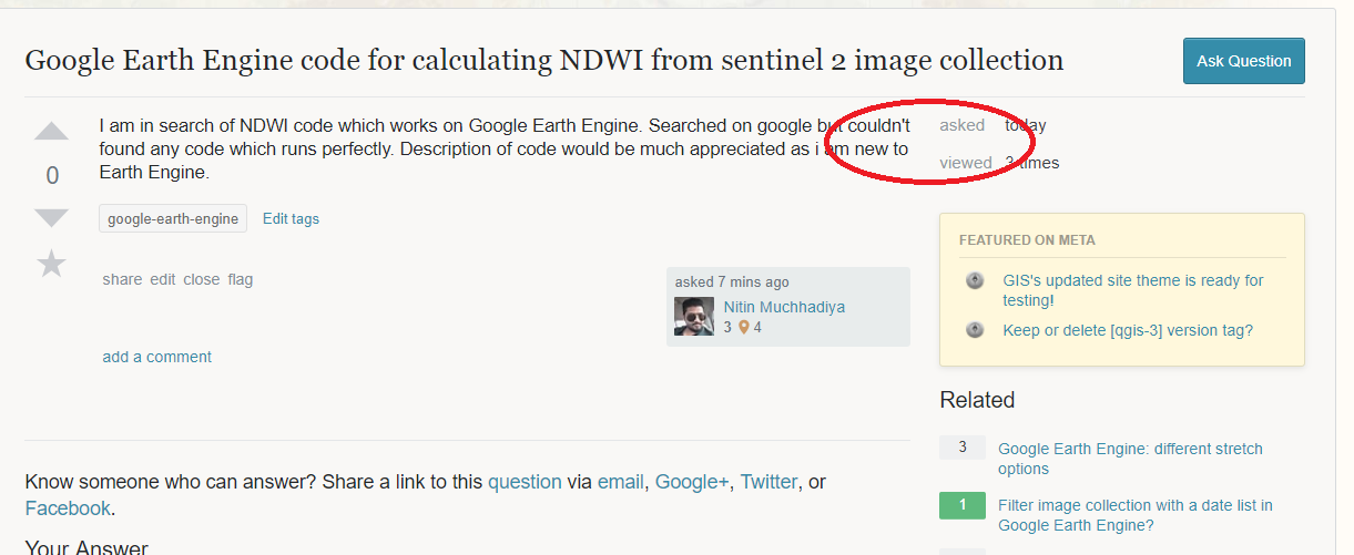
This is the only site that I've tested this new design on, so I don't know if it is a site specific issue, or a general network wide design choice.

When you look at questions, the text abruptly wraps around on the right hand side, and the users eyes carry on to the 'asked' section. enter image description here

I would prefer that there be more visual separation here. Maybe increase the right padding on the Question body area?

2
  • 1
    This isn't really a change from the current behavior, though. Is there something different about the new view that makes this different? I'm guessing the "abruptness" is due to the question title being long but that hasn't changed.
    – Catija Staff
    Commented Sep 19, 2018 at 21:03
  • Yes you are right.. I'm surprised that this never bugged me before. Commented Sep 20, 2018 at 9:07

You must log in to answer this question.

Not the answer you're looking for? Browse other questions tagged .